Client
Personal Project
Overview
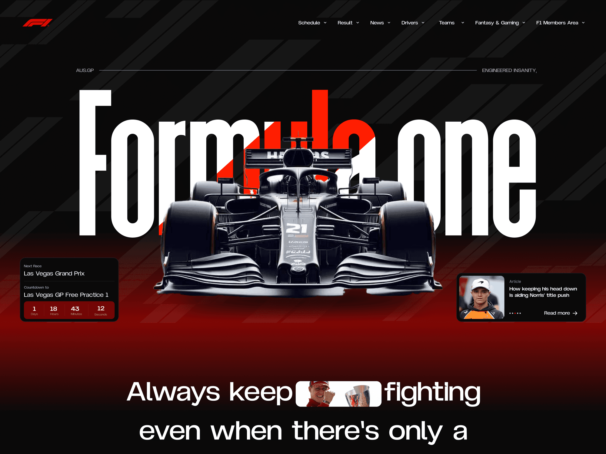
This personal project aimed to rethink the Formula 1 digital experience by introducing a more dynamic, visually intense interface aligned with the sport’s energy and speed. The redesign emphasizes accessibility, clarity, and excitement — combining vibrant color accents, structured data presentation, and high-impact visuals.
Client
Personal Project
Industry
Motorsport
Service
UI/UX Design
Redesign
Web Design
Content
Duration
3 days
The Challenge
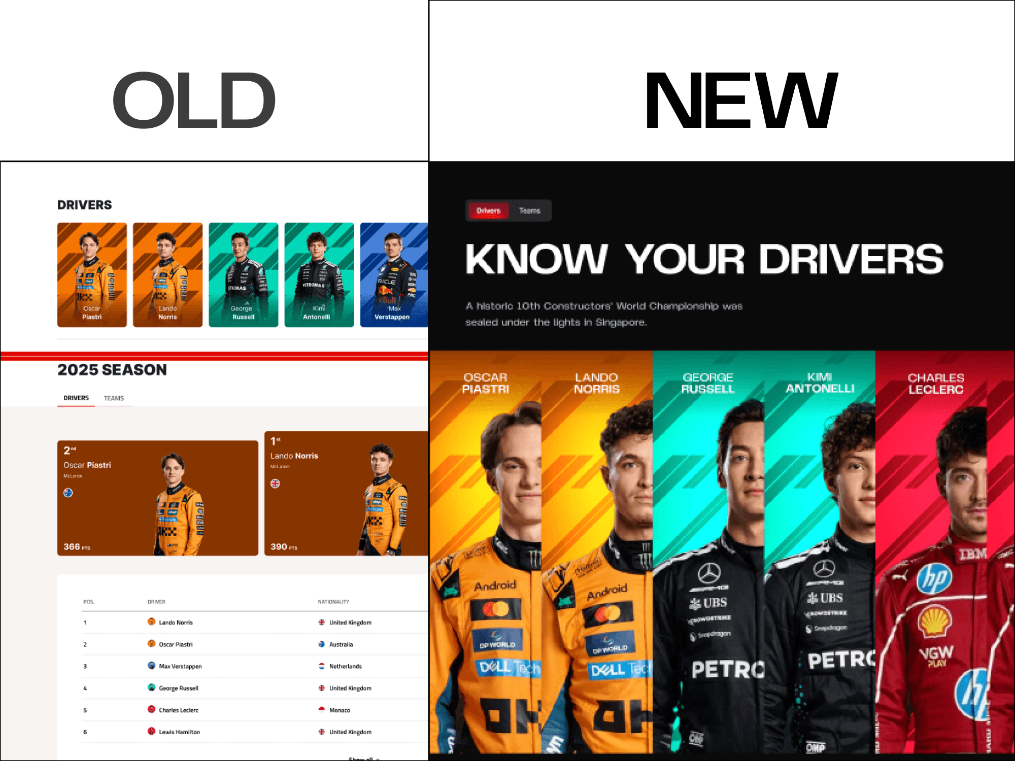
The current Formula 1 website (formula1.com) provides extensive information but feels dense, segmented, and visually outdated. Key issues included: Overcrowded layouts and inconsistent vertical rhythm Limited hierarchy for race stats, standings, and schedules A lack of strong visual identity despite F1’s dynamic branding User flow that makes it hard to jump between race results, team details, and upcoming events The challenge was to redesign the site with a clearer structure, stronger visuals, and a more engaging presentation of racing data.
The Solution
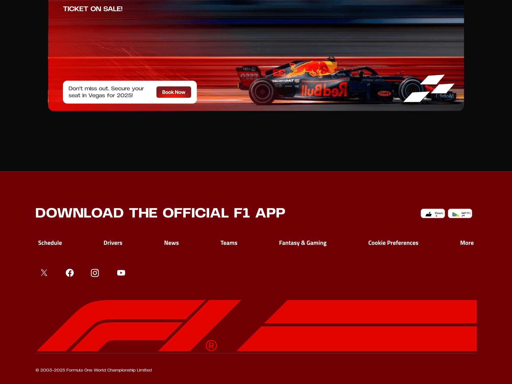
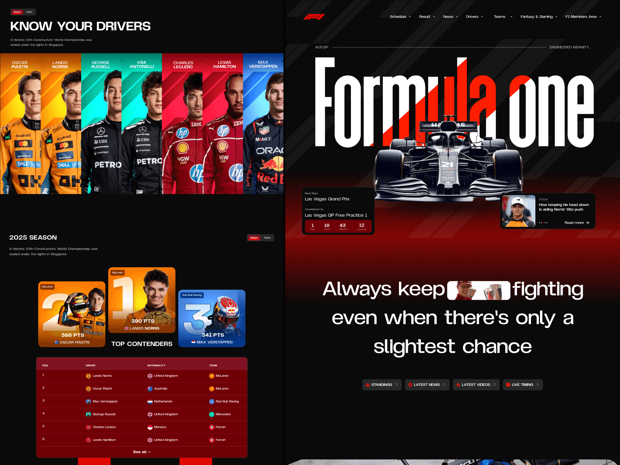
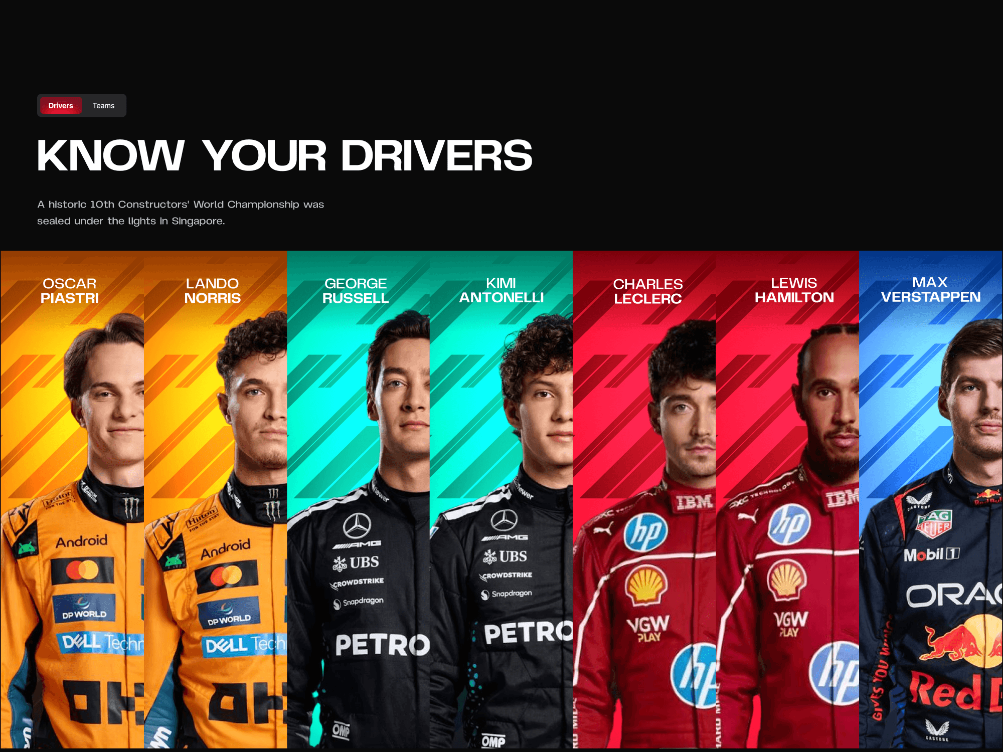
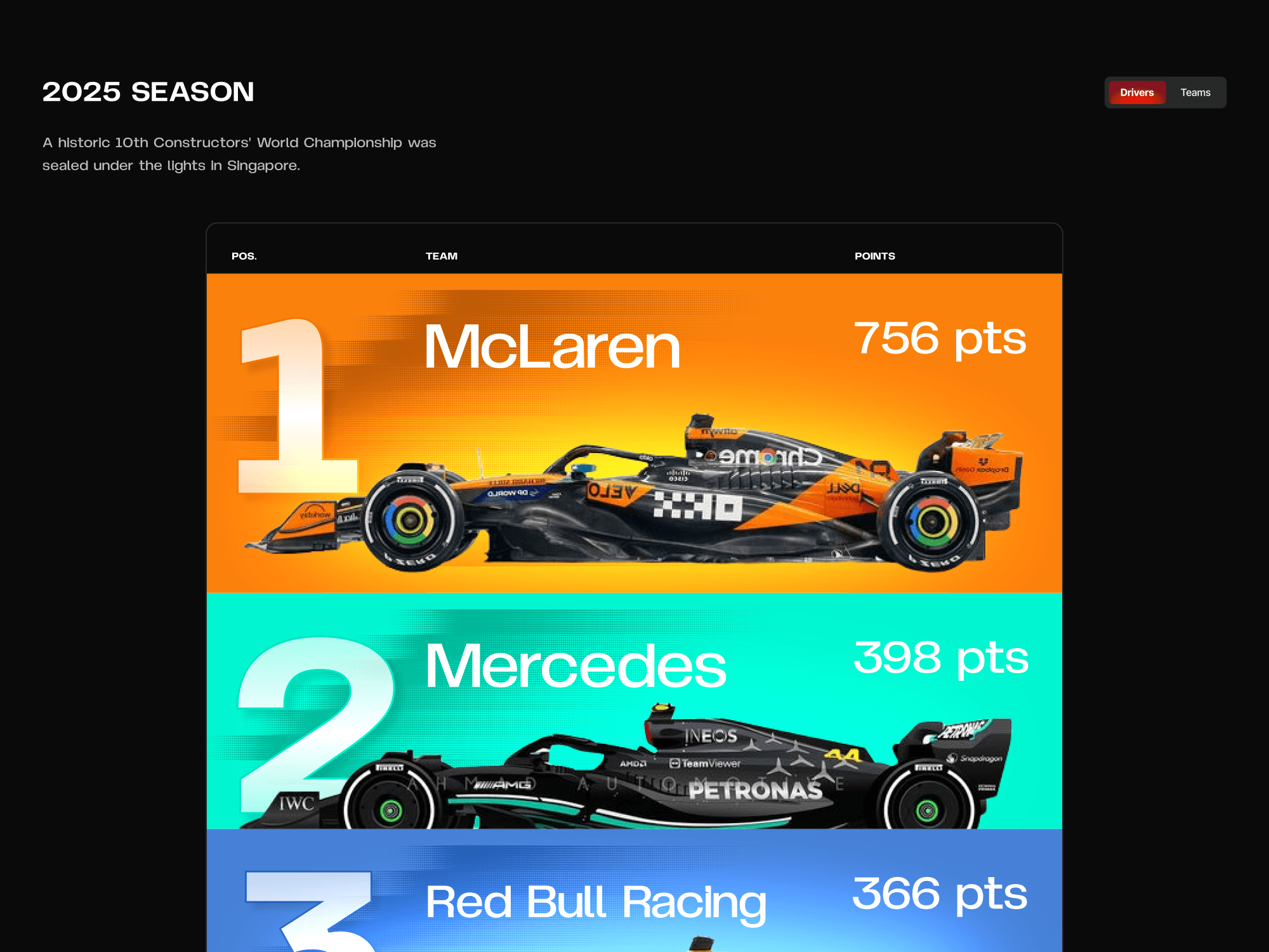
I created a modern, fully reimagined UI with: Bold racing-inspired visuals — high-contrast colors, sharp grid layouts, and dynamic typography Improved information hierarchy — separating news, standings, drivers, and schedules into easily scannable sections High-impact hero sections featuring race imagery and highlight moments Color-coded driver and team identity blocks for instant recognition Revamped race timeline layout with clear visual anchors for overtakes, crashes, pit stops, and key moments Modular content blocks that make stats and updates easy to browse The redesign focuses on giving fans the thrill of the sport while presenting data cleanly and interactively.
The Result
The new concept offers a more immersive and user-friendly Formula 1 digital experience: Stronger visual identity aligned with the sport’s intensity Cleaner layouts that make stats, standings, and race moments easier to digest Enhanced storytelling through visuals, color coding, and structured timelines A modern aesthetic that feels premium, fast, and fan-focused The redesign demonstrates how F1’s brand could translate into a more dynamic, exciting, and intuitive website experience.